Artist Tanya Wood
Creates intricate pencil drawings which makes use of white space to enhance the viewing of the drawing. For example the semi detached (Woods, 2013) feels like you are looking through a window with only what you see in the glass, drawn off centre, the rest left white. Theres clearly a reflection of the room super imposed on the view of the opposite house outside. I often notice a reflection super imposed in our lounge window of two views because its a corner window. However in Tanyas picture the reflection is of the inside against the outside made possible because theres strong sunlight shining on the inside room compared to the outside house in shadow.
Her detailed drawings of the platform edge show texture which breaks down from fully drawn with colour to just outlines. This reminds me of a creepy crawly drawing described in a magazine (Whitton, 2017) where you capture whats interesting in detail and the rest fades away with less detail. It also means the composition is a little organic as you add detail until you are happy. Could I use this technique whilst drawing my environment and not worry about composition too much.
Tanya also created some interesting displays of her work where she included the perforated edge of paper next to the drawing of the perforated edge. There were drawings of train passengers seen through the train windows displayed with custom white boxes on a table. This seemed to reflect the experience of viewing the train as it passes by and you look through the windows. I should note the experience which is important to see how the display can support.
At the same time I don’t like the detail in the way it seems to be a perfect copy. Although I feel its well balanced by the white space.
I tried sketching the grass next to a paved area at sunset and could see the big shadows for the tufty blades of grass. The grass is clumpy with gaps.

Artist Archie Franks
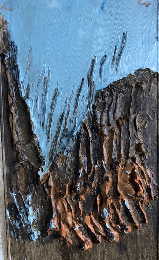
I like the monster munch with moon painting (Franks, 2016) which makes a monster out of the crisp packet. Its humorous. The packet and crisps come alive with the sharp impasto paint. There are sharp short marks on the crisps and with longer marks used on the packet. The background is thinner with very long marks. It feels animated and alive. The moon is broken, possibly reflecting off something and contrasted with the sharp crisp packet. Theres an blog which gives insight into Archies’ studio (Hamlett Dobbins, s.d) which shows how thick the impasto paint is, and what medium he uses, and the amount of paint he mixes, how big the pictures are and things which influence him such as horror movies. I’d like to try out some of these points to recreate how he would paint my environment. In particular I’ve seen some palm roots which look like the trees guts coming out. He obviously uses more imagination to bring the crisp packet to life and the horror movies influence his style. I dont like the way they get very dark although it is hard to view online and see subtleties in the paint.
In the absence of oil impasto medium (on order) I tried painting some roots with acrylic mixed with gel with a brush and a cake bag to squeeze the paint out in strips. I think there may not have been enough paint, it became to peaky and sharp and couldnt get a more rounded finish.
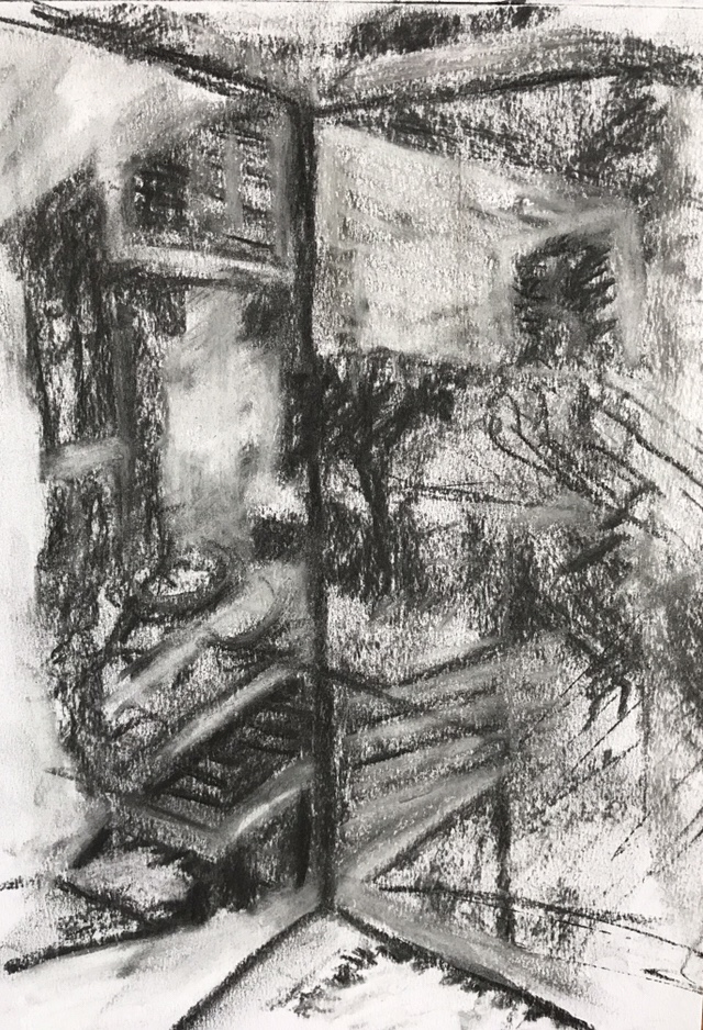
Artist Tim Stoner
I like his charcoal sketches which use thick charcoal lines and two tones where he most likely uses chalk for light tone and charcoal for dark on paper. They are very simple using simple shapes.
I applied this to sketch the corner of our flat where a reflection of the outside of the flat is reflected on the outside view. Being able to emphasis the lines and angles and block in the light areas felt natural. Theres something interesting about seeing the outside inside and also the view.
His paintings are on the large scale almost life size views on the world which must make an impact when viewed in person. I like how they continue the style of the sketches with charcoal and smaller paintings on panel and paper. They look like they have been shaded in with pastels or chalk in many layers. The outlines are often visible. He seems to captured in late afternoon or early morning light causing silhouettes with little features visible and long shadows.
There are some interesting tree shapes in the gardens like the palm tree (Stoner, 2015) where he simplifies to basic shapes like a cartoon. Although its not recommended to sit below because the leaves are very heavy and do fall off.
I’m not sure I like the way he sometimes turns the painting into angular geometric shapes.
I’ve tried painting our plaza using oil on canvas. I used oil thinned down with linseed oil and thinner to paint the scene very roughly. I then used a knife to scrape away the highlights. This gave a sharpness to the rough painting. The silhouettes of people and parasols and sharp edges follow his approach which focusses on shape. Perhaps the scraping of paint lends itself to more simple angular shapes. I also understands he layers thin white washes for the highlights so I need to discover which is appropriate and how they combine or if they are not combined.

Suggested reading
The Poetics of Space (Bachelard, 1994) provided a strange source for inspiration from the suggested reading. It is a difficult book to read and absorb because it is highly philosophical and I doubt I really absorbed what he was trying to say. However I’ve taken hints about contrasts of inside and outside and the experience of the small or miniature. About childhood places where you can hide and daydream. Its about how the space influences the experience of those living there and expressing it. With my environment the inside is small but it is a refuge and holds your personal things from the hustle of the city. The outside calm and relaxing sometimes too quiet. Life during the day is mostly the people who look after the residential area and provide services. Other interesting thoughts from the book is what a child would draw when asked to draw their home. They would draw whats important to them often highlighting something on the outside and inside. This is unlikely to be in proportion but is important detail. This got me thinking about the meaning of painting detail and usually I associate detail with finer realistic details but now it could be adding something important which is visually unrealistic.
After reading James Putnam’s book (Putnam, 2001) I can see there are potentially lots to consider in the displaying of artwork. I found it hard to see how I would apply this because it is mostly relating to the display of collections however this assignment would result in a collection of paintings. The basic point being I can make use of the way museums display work or store work to give the appropriate viewer experience. For example if I were to paint life size replicas of the things I see in my environment I might display them on the floor roped off with a viewing platform and labels. This would make them look important and protected. Whilst I don’t like the works of the naturalists such as John James Audubo and to some extent the detail of tanya woods I can see this reflects a detailed account of the artefacts. There is an element of controlling the way the viewer sees the art. Tanya was able to do this in viewing people on the train through windows as they pass you on the platform (Wood, 2014).
References
Bachelard, G., Jolas, M. and Stilgoe, J. (1994). The poetics of space.
Franks, Archie (2016) Monster munch with moon At:http://archiefranks.com/portfolio/monster-munch-with-moon-2016/ Accessed on 11/1/18
Hamlett Dobbins. (s.d) archie franks. At:http://hamlettdobbins.com/studio-visits/archie-franks/ (Accessed on 11/1/18)
Putnam, J. (2001). Art and artifact. New York, N.Y.: Thames & Hudson.
Stoner, Tim (2015) Palm At:http://www.timstoner.co.uk/www.timstoner.co.uk/paintings.html Accessed on 11/1/18
Whitton, Judi (2017) Creepy-crawly drawing In: The Artist Dec 2017 p.49.
Wood, Tanya (2013) Semi-detached 4St. C At:http://www.tanyawood.co.uk/work/2013-2/ Accessed on 11/1/18
Wood, Tanya (2014) Neither here nor there boxed At:http://www.tanyawood.co.uk/work/2014-2/ Accessed on 11/1/18

